In this article
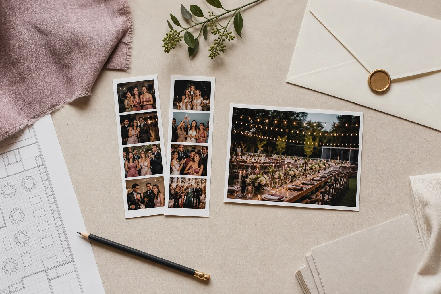
Photo strips suit events where guests want a playful keepsake that slips into a pocket, guest book or place setting. Postcard prints suit layouts that need a larger photograph, more breathing room for event artwork or space for a short message. Neither format is automatically better. Choose from the number of photographs you want to show, how guests will use the print and how much branding or event detail must fit without making the design cramped.
Before approving artwork, ask for a proof at the actual finished size. A layout that looks clear on a laptop can become difficult to read once it is printed.
Start with what the print must do
Print format is a planning decision, not only a design preference. Decide what should happen after the photograph is handed over.
A wedding couple may want one copy for guests and another for a guest book. A corporate team may need a larger event lock-up, sponsor line or campaign treatment. A birthday host may prefer a compact strip that feels informal and easy to share.
Write down the print’s main job:
- a personal keepsake for each guest;
- a contribution to a guest book or memory table;
- a branded event takeaway;
- a place-setting detail;
- a larger group photograph that is easy to see;
- a simple record of the date and occasion.
This prevents a common problem: choosing a fashionable shape first, then trying to squeeze the photographs, names, date and artwork into the space that remains.
How photo strips and postcards differ
The most useful difference is not the label. It is how the available area is divided between photographs and design.
| Decision | Photo strips | Postcard-style prints |
|---|---|---|
| Overall feel | Compact, playful and familiar | Larger, more like a conventional event photograph |
| Photograph sequence | Well suited to several small frames | Better for one larger frame or a restrained multi-frame layout |
| Artwork space | Limited and vertical | More flexible around or below the photograph |
| Guest book use | Easy to place beside a handwritten message | Takes more page space and may need a larger album |
| Pocket or handbag | Usually easier to carry | More likely to need an envelope, folder or careful handover |
| Group visibility | Faces become small when too many people fit into each frame | A larger image can make groups easier to see |
Actual print dimensions and printer options vary by supplier. Confirm the finished dimensions, orientation and number of copies with QuikPix before designing stationery, guest-book pages or display holders around them.
Choose strips when the sequence is part of the fun
A strip works well when the design relies on a short sequence of expressions or poses. The repeated frames create a small story, and the narrow shape feels recognisably connected to event photography.
Strips are also practical when guests will add a copy to a guest book. Their shape leaves room on the page for a message, provided the album has been planned around the finished strip dimensions.
Watch the scale of the faces. Four small frames can work for two or three people standing close together. The same layout becomes less useful for a large group because every face must fit into a narrow area. If group photographs matter, test the likely group size in the proposed frame before approving the template.
Keep the artwork simple. Event names, a date and one restrained visual motif usually have more impact than a border filled with small logos and decorative elements. Leave a safe margin around important content so trimming does not make the design feel uneven.
Choose postcards when the photograph needs more space
A postcard-style layout gives the main image room to breathe. It is useful for group photographs, formal events and designs where the photograph should remain the strongest element.
The larger area can also accommodate a campaign line, event identity or sponsor treatment without placing text over faces. That does not mean every open space should be filled. A clear hierarchy still matters:
- the photograph;
- the event or couple’s identity;
- the date or short supporting line;
- any required brand or sponsor marks.
For corporate events, obtain the current logo files and brand guidelines from the person who owns approvals. Do not copy a logo from a website or presentation screenshot. Confirm whether sponsors require minimum clear space, a particular order or a monochrome version.
At weddings and private parties, a postcard print can feel more like a photograph intended for display. Consider how guests will carry it home. If the event includes small handbags, outdoor areas or several takeaways, an envelope or collection point may be more practical than leaving guests to hold a larger print all evening.
Decide how many photographs belong on one print
More frames do not always create more value. Every added frame reduces the size of the people in it and the space available for the design.
Use one strong photograph when group visibility matters. Use two frames when you want some variety without making each image too small. Use a longer sequence when the changing poses are the point of the layout and the likely groups will remain small.
Ask for a proof containing realistic group sizes, not only a sample with one or two people. Check:
- whether faces remain recognisable at arm’s length;
- whether heads or hands sit too close to a crop;
- whether dark clothing disappears into the background;
- whether event text remains readable;
- whether logos retain their required clear space;
- whether the frames still feel connected as one design.
If guests will photograph the physical print with a phone, overly small type and thin lines are even less useful. Design for the printed object first, then check how it appears in a quick phone photograph.
Match the layout to the event identity
The template should feel related to the invitation, stage graphics or internal campaign, but it does not need to reproduce every visual element.
Choose one or two recognisable cues: a colour pair, border shape, type style or small motif. This creates continuity without turning the print into a miniature poster.
For a wedding, confirm the spelling of both names and the preferred date format. For a corporate event, confirm the approved event title, master logo and any sponsor hierarchy. For a birthday, decide whether the age, name or theme should lead.
Avoid putting critical wording over a busy photograph area. People move within the frame, and a text position that works in a static mock-up may cover clothing or faces in real use.
Plan the guest book and print handover together
If one copy belongs in a guest book, decide who places it there and when. Guests may need adhesive, a suitable pen and enough table space to write without holding up the next group.
Check the album page size against the real print. A narrow strip can leave a useful writing area, while a postcard may need one print per page. Thick prints, adhesive corners and several layers can also make an album difficult to close.
Place the guest book close enough to the print handover that the next step is obvious, but outside the queue. Finished groups need space to look at their prints and write a message without blocking people waiting for a photograph.
The same principle applies to a corporate collection point. If prints are sorted, sleeved or paired with another item, assign one person to the handover and allow table space. Do not add the process at the last minute beside a narrow venue passage.
Check the artwork proof properly
Approve the physical result, not only the digital file.
Request a proof at the intended size and review it in normal room light. Check names, dates, punctuation, logo versions, crop positions, borders and colour contrast. Ask the relevant brand owner or event decision-maker to sign off the final artwork before the supplier deadline.
Keep the approval trail simple. One named person should consolidate changes. Conflicting comments from a couple, venue, agency and sponsor can introduce errors close to the event.
If the design changes after approval, issue a new version and retire the old proof. File names such as `event-print-v3-approved` are clearer than several documents called `final`.
Questions to confirm before you approve the format
- What are the exact finished dimensions?
- Is the print vertical or horizontal?
- How many photographs appear on each print?
- How many people should remain clearly visible in a frame?
- How many physical copies are produced per session?
- Will one copy go into a guest book?
- Who supplies and approves the final artwork?
- Are there brand or sponsor rules?
- How will guests carry or collect the print?
- What is the final artwork deadline?
The print decision should be made alongside the event flow and operating window, not after the floor plan is complete. If you are still comparing the broader experience, use the QuikPix photo booth guide to review the available options. For weddings, the guide on where to place the photo experience at the venue covers access, power and queues.
When you are ready to confirm which print formats are currently available for your date and event, contact QuikPix with the event type, venue, guest count and artwork requirements.